User-centred software design
Maira, you have been working on modernising the screen and UX design for CEITON in the recent years. What does usability mean for a software?
In the past, the approach to developing software was very much functionality based. A software developer usually addresses this in a very rational way, much like an engineer. However, most of the users interact with applications in a different way. Error messages are a good example. It is important for a software not to talk like a machine. So something like “Error 505” is really unacceptable. It is much better to engage the user in a more empathetic way: “Oops, something went wrong there. Our support team will be glad to assist and take care of this for you.”
With a new software or feature, the user will always have to learn how to use it and to internalise this usage process. If the user does not really understand the software even after taking part in training, they will be annoyed every day. A user-friendly software, however, supports the user actively. It forms the interface towards the human, guides them through the entire usage process and provides them with feedback. It is immensely reassuring for a user to know that they are on a good track.
“If a user trusts a software, they will work with it more productively.”
World Usability Day is held annually in mid-November and focusses on user experience and user-centred design.
Maira Marcucci
Product and UX Designer, expertplace solutions GmbH
The user-centred design concept puts the user and their needs first – the development process then builds on this, and not the other way round. Usability is: user first, then the process, and then the software. What a UX designer does is to foreground the human part of a software.
In order to find out what exactly the users‘ needs are, we also involve our customers in tests.
The usability test itself is only one part, albeit a big and important one, but still only a part. If a customer approaches us with a request, e. g. for a new time-tracking tool, I conduct an interview with the users at first. I do this to collect information: What do they need? How do they work? What is the general context, and what is their work cycle? Once I have all these data, I start on the specific use cases. And only then do we carry out the usability tests.
How do you conduct such a usability test?
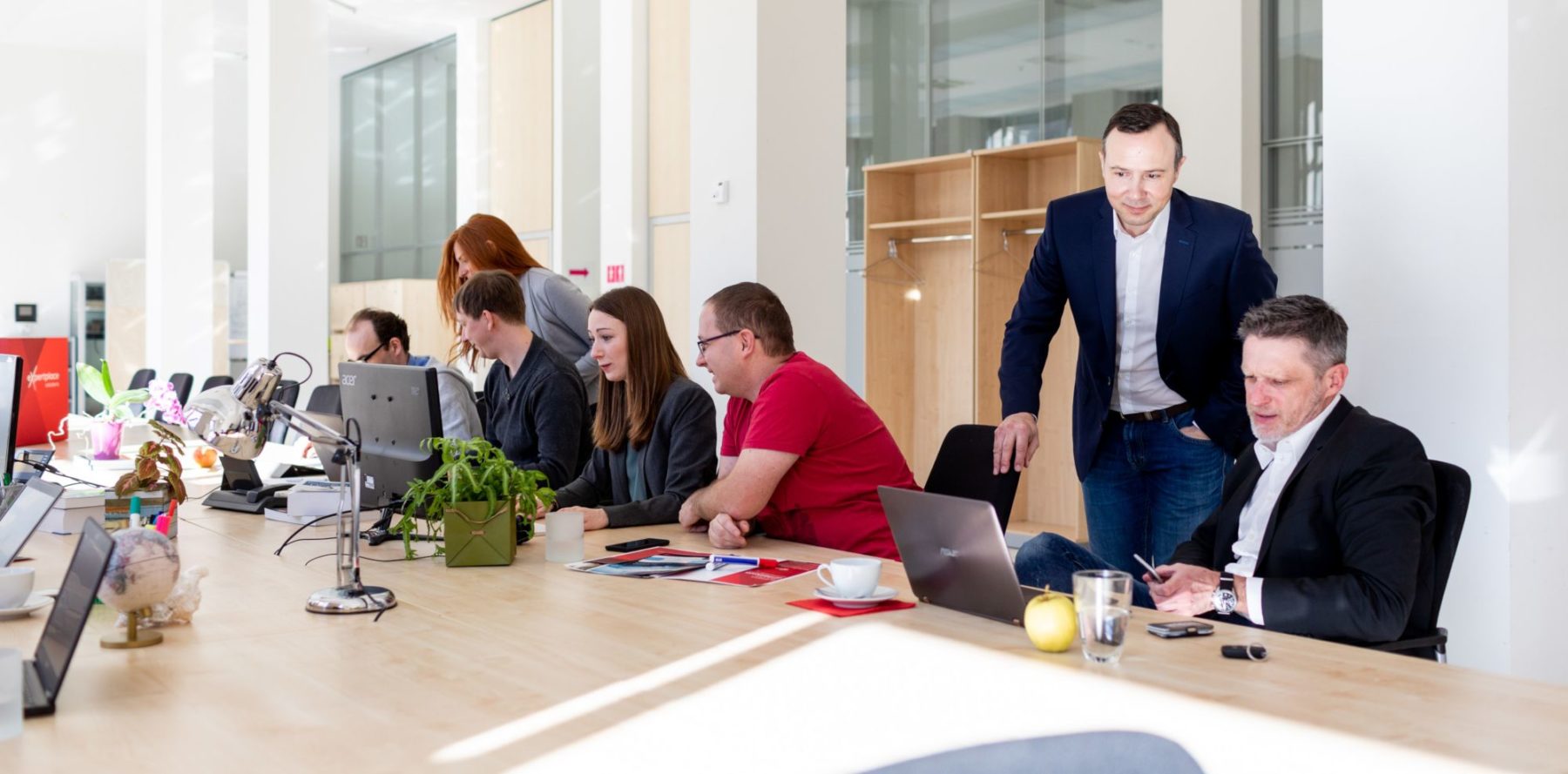
We simulate the real tasks of a user with the software which allows us to see what exactly the users do with it. I am present during this test to ask questions, to observe the test and, if necessary, to support the user. As every user has their own way of working, the answers in such a test can be a bit subjective. This is why I prepare a script prior to the test. I ask the users solely about their experience, not about their wishes. The way the questions are asked must be objective: “What are you looking at right now? What do you see? What are you looking for on a page? Where do you need to navigate?“ You have to be really strict with yourself about not asking any leading questions, such as, “Do you think it could be better that way …?” That does not work, and it will mess up your entire test.
“Opinions and assumptions are dangerous and should not be treated as truths by a UX designer.”
You really have to be careful about these little details in order to be able to collect real and objective data. Afterwards I closely watch the recordings; each usability session should be recorded. I note down my observations, about what I can see and where there are problems. I view the current process and compare it to what it should look like ideally. Such a usability test enables you to see everything that is going wrong.
CEITON is a very complex system; there are many ways to work with it. Sometimes the way the users use it in reality is entirely different from what you expected. This is why usability testing is so important. For example, if there is a complex work process of ten steps, the user might not find this very intuitive, so they break it down into five small processes. Every user has their own approach and standard behaviour. In usability tests and UX design, you have to look out for exactly these patterns. Where is the common denominator in them?
Have you seen a real surprise during any of the tests?
Yes, for example with colour codes. How colours are perceived varies slightly from person to person. I have noticed that the colour yellow is perceived as orange by many users. This is important to know in terms of colour psychology because every colour has its own effect.
Icons are also always a surprise factor. With a workflow system such as CEITON, I had assumed that everything should be designed in a very minimalist and clear way. A very simple, clear icon may be good from a design point of view, however, it turned out that the users lack the connection to it. Give the icons a bit more colour or personality, make it look a little cuter or provide it with some more original forms, and the users will go wild. They really love that. That was something which I had not anticipated. People react much more lively to emotions than to an extremely clean, utilitarian way of working.
What color do you see here?
Our clients love this icon. It symbolises the option to enter work time requests.


 pexels-andrea-piacquadio